Faculty’s introduction:
THE INTERNATIONAL ECONOMICS FACULTY’S HISTORY OF FORMATION
On 14th April 2014, the Rector of Banking University in Ho Chi Minh City signed the Decree number 376/QD-DHNH establishing Faculty of International Economics with human resource mainly based on lecturers of Economics major of Faculty of Fundamental Education and Faculty of International Banking (those are two of major academic parts of the university since it was named Banking University in Ho Chi Minh City).
Faculty’s main information:
|
Vietnamese name
|
Khoa Kinh tế quốc tế - Trường Đại học Ngân hàng Thành phố Hồ Chí Minh
|
|
English name
|
International Economics Faculty – Banking University Ho Chi Minh city
|
|
Business name
(Abbreviation name)
|
IEF - BUH
|
|
Logo
|

|
|
Slogan
|
Creating Trends and Success
|
|
Head office
|
1st floor, 39 Ham Nghi street, Nguyen Thai Binh ward, 1st District, Ho Chi Minh city
|
|
Thu Duc office
|
1st floor, B stage, 56 Hoang Dieu 2 street, Linh Chieu ward, Thu Duc district, Ho Chi Minh city
|
|
Facebook
|
https://www.facebook.com/khoakinhtequocte.buh
|
|
Fan Page
|
https://www.facebook.com/kinhtequocte.buh
|
|
Established decree
|
number 376/QD-DHNH on 14th of April, 2014
|
|
Staff of lecturers
|
32 lecturers consisting of:
1 Associate Professor;
11 PhDs, MAs - main lecturers and PhD candidates;
17 MAs and Master students;
4 BAs
|
|
Scientific researches
|
Ministerial level: 13 (team leaders: 2, attendants: 11)
Base level: 40 (team leaders: 12, attendants: 28)
Research, scientific conference (domestic and foreign): 142
Textbooks, reference documents: 30 (editor: 9, attendants: 21)
|
|
Curriculum
|
Bachelor of International Economics
|
THE MEANING OF LOGO OF THE INTERNATIONAL ECONOMICS FACULTY – BUH
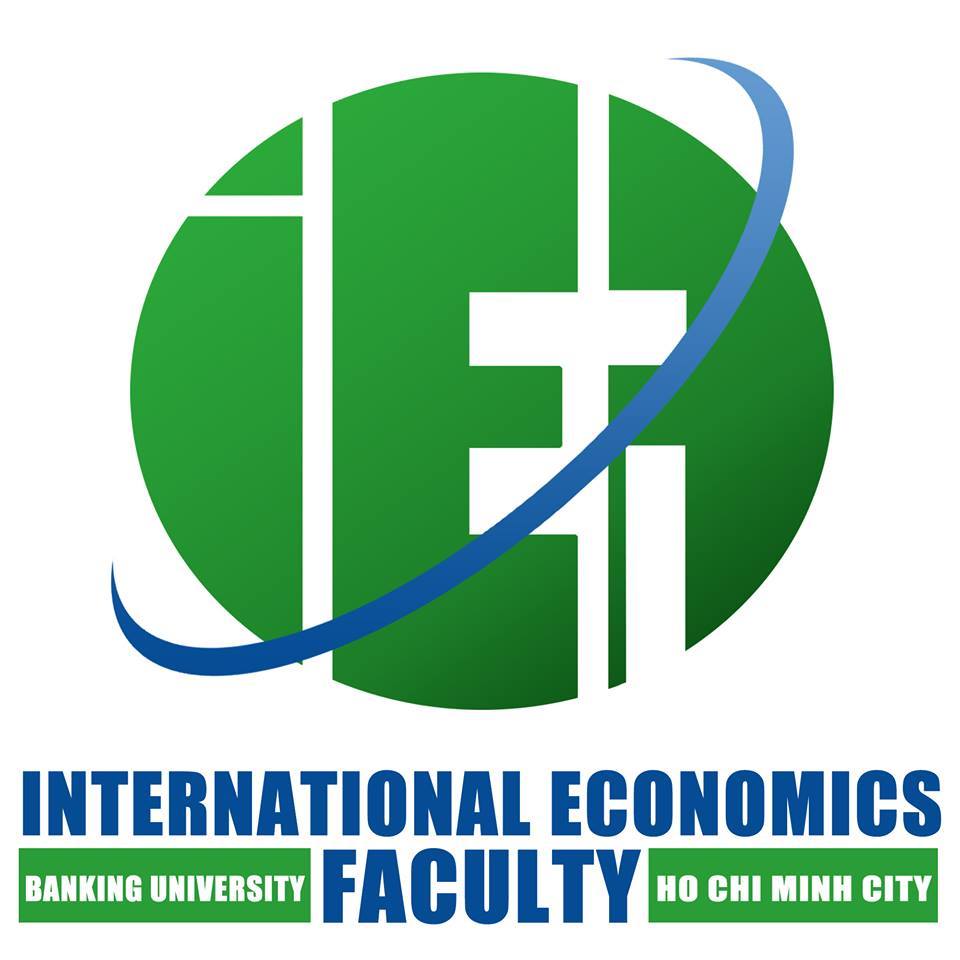
Logo of the International Economics Faculty, Banking University in Ho Chi Minh city is designed with the inspiration from the globe which is usually used in learning and researching on geography, economics, international exchange… The image of the globe connects closely with the mission of the International Economics Faculty, which brings to the students a prestigious and high quality education environment and scientific researching, meets the human resource need for settling and developing our country.

The logo is designed with three basic parts of a globe: including the sole, the globe and the belt.
The sole: formed by the harmonious combination of the words: INTERNATIONAL ECONOMICS FACULTY – BANKING UNIVERSITY HO CHI MINH CITY, creating a firm rectangular block, taking the foundation of International Economics as a basis for motivation of the sustainable movement and development. With this design, the logo represents an integral connection between the Faculty of International Economics and the Banking University in Ho Chi Minh City, in which the Faculty is a part of the University with a long historic tradition and outstanding reputation.
The globe: the center of the logo, with creative and breakout design, contains three characters: IEF is the abbreviation of faculty which creates visual stimulation, encourages creativity from students, trainees as well as viewers. Particularly, the letter F is written backward in a unique way to show breakthroughs, which contains many mysteries that need to be solved, like vast treasures of knowledge to be discovered. The image of IEF globe helps to locate the brand of International Economics Faculty in learner’s mind and the public’s ones: Integration - Efficiency – Flexibility.
The belt: is designed according to the imitation of the stars, the planet in the universe, representing the form of motion around the axis, orbiting the Earth, the planets and the stars. The images show the continuous movement to create the development, innovation, pioneer of the International Economics Faculty, like the movement of the Earth to create different seasons, day and night ... for new flexible life.
The International Economics Faculty’s logo is designed with two main colors green and blue, which are harmoniously combined, highlighted on a white background. Green is inspired by the color of the Earth's continent, shows freshness, vitality, rich potentiality for development and innovation. The blue one is inspired by the color of the ocean and the sky, which is considered as the color of wisdom, shows professionalism, trust and hope. The great combination of two colors in the logo also means the unity, harmony between continents and the ocean’s color on the Earth, combining to create a whole perfect unity with full vitality and faith.
International Economics Faculty’s logo brings the message of commitment to quality training, scientific research to the students and the social community. In addition, the logo is a symbol of solidarity between faculty leaders, lecturers and students in a common family: International Economics Family. With that relationship, International Economics Faculty will always be the cradle for dynamic, creative, talented, high-qualify and skillful people, who are worthy to be talents contribute more and more to the integration and development of our country.
International Economics Faculty – Creating trends and success!